Case study - Serviced accommodation
horizenhaven.com
A warm website for serviced accommodation in Southampton, with clear routes for guests, landlords, and partners.
The brief
Make the offer easy to understand and easy to trust.
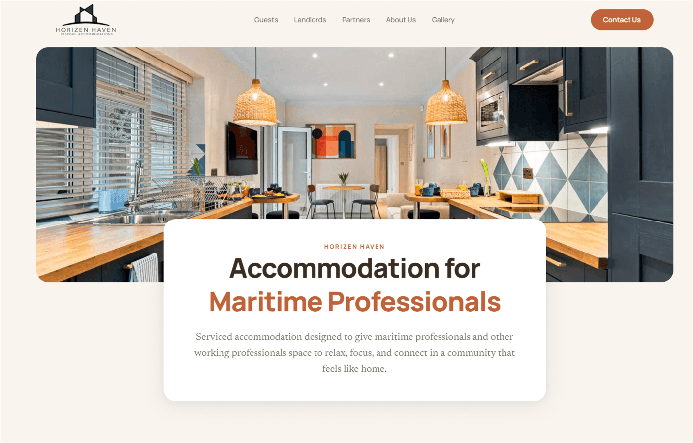
Horizen Haven needed a website that did more than show rooms. The brand works across hospitality, property, and professional accommodation, so guests needed to feel reassured, landlords needed to understand the care around their property, and partners needed a clear view of the wider plan.
The first screen had to say something specific. Horizen Haven offers fully serviced accommodation for maritime and working professionals in Southampton, designed for rest, study, work, and community. From there, the site needed to help each audience find the right next step.
The approach
Give each audience a clear route.
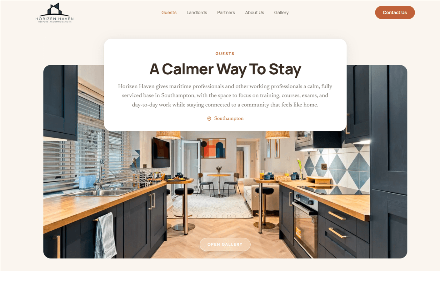
We structured the site around the three groups Horizen Haven speaks to most often: guests looking for a calm place to stay, landlords considering a different way to use their property, and partners who need to understand the business clearly.
Each route has its own page, message, and enquiry path. That keeps the homepage calm while helping visitors recognise where they belong and what to do next.
The visual system
A calmer kind of accommodation site.
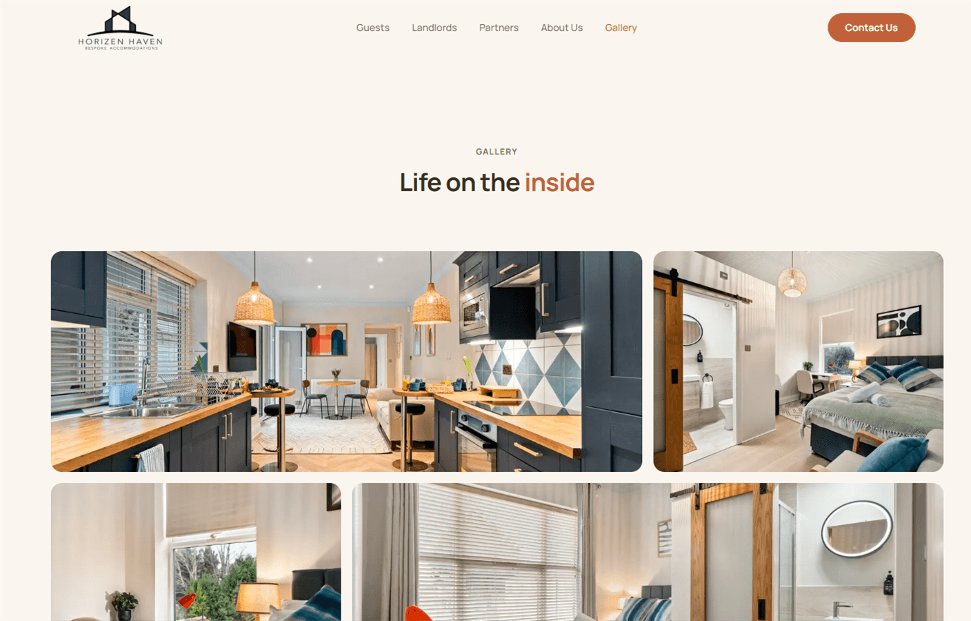
Accommodation websites can start to feel like booking engines before they feel like places. For Horizen Haven, the design needed to make the properties feel calm, comfortable, and cared for before someone opened the gallery.
The soft neutral background, rounded image framing, warm copper accent, and generous type all work with the photography. The site feels closer to a considered home than a listing directory.
Trust and clarity
The proof changes with the audience.
Guests look for comfort, location, and a sense of how a stay might feel. Landlords look for signs that their property will be looked after properly. Partners need enough structure to understand the plan without the page promising more than it can prove.
We wrote and arranged the content around those different questions. The language stays direct, the imagery does useful work, and each enquiry route asks for the information that makes sense for that person.
Under the surface
Built to be found and used.
The site was built with the basics in the right place, including clear page titles, semantic structure, responsive images, and routes for the accommodation and partnership searches that matter to the brand.
Contact was also split by intent. Guests, landlords, partners, and general enquiries each have a route that fits what they are asking for, which makes the site more useful after the first impression.
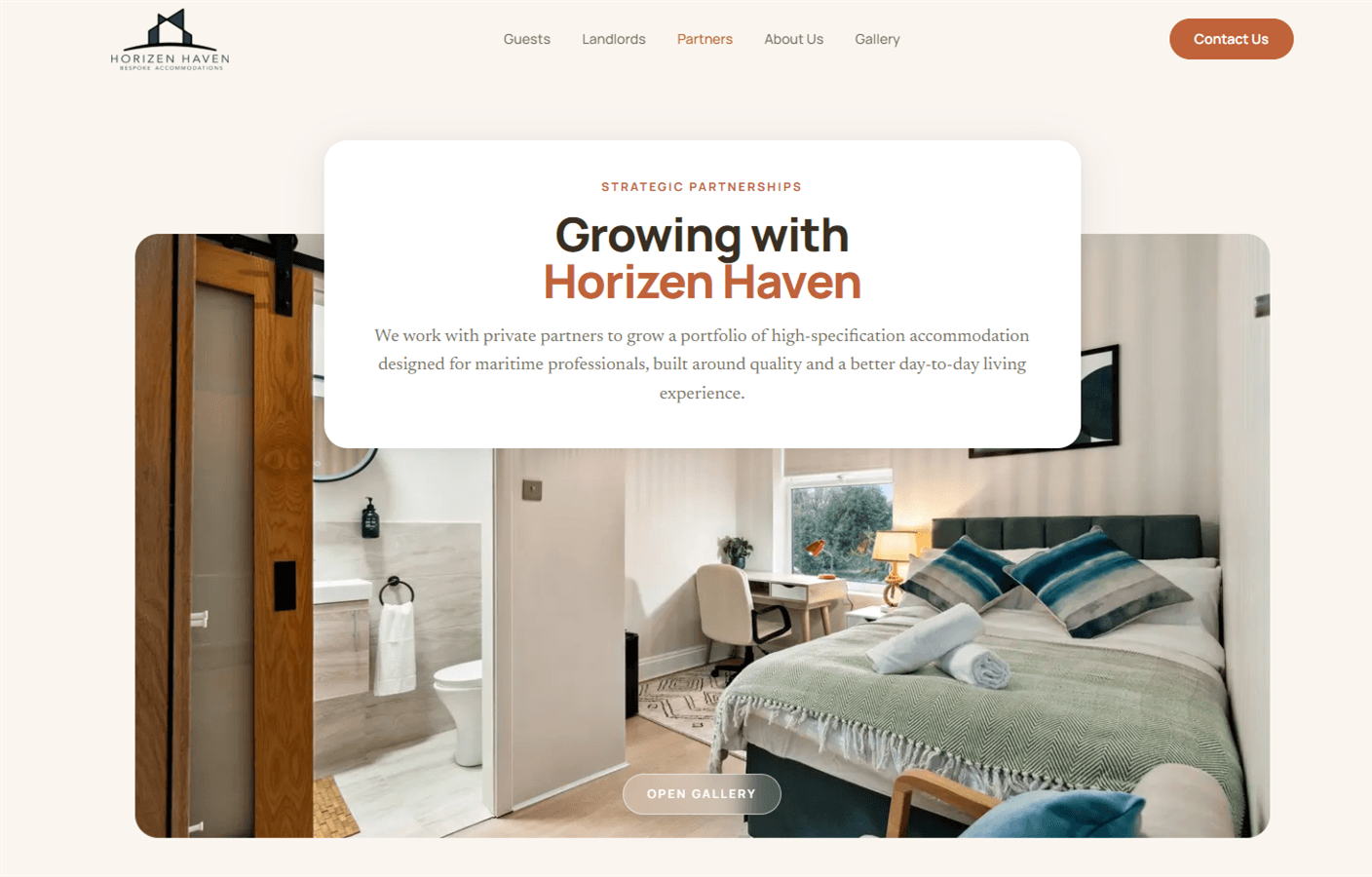
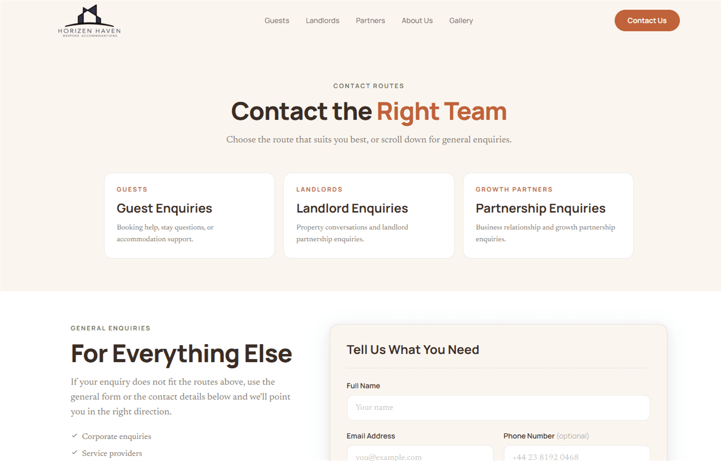
Contact routes - guests, landlords, partners, and general enquiries separated by intent.
A property brand website should make the offer feel real, trustworthy, and easy to act on. Horizen Haven now has a site built around those jobs.